Case Study: Author Eileen Garvin's New Squarespace Website
We love creating Squarespace websites for authors and writers.
Thanks to some wonderful referrals, particularly from the lovely Michelle Nijhuis, we get to do so several times a year. We were happy to wrap up our 2020 website projects with one such site!
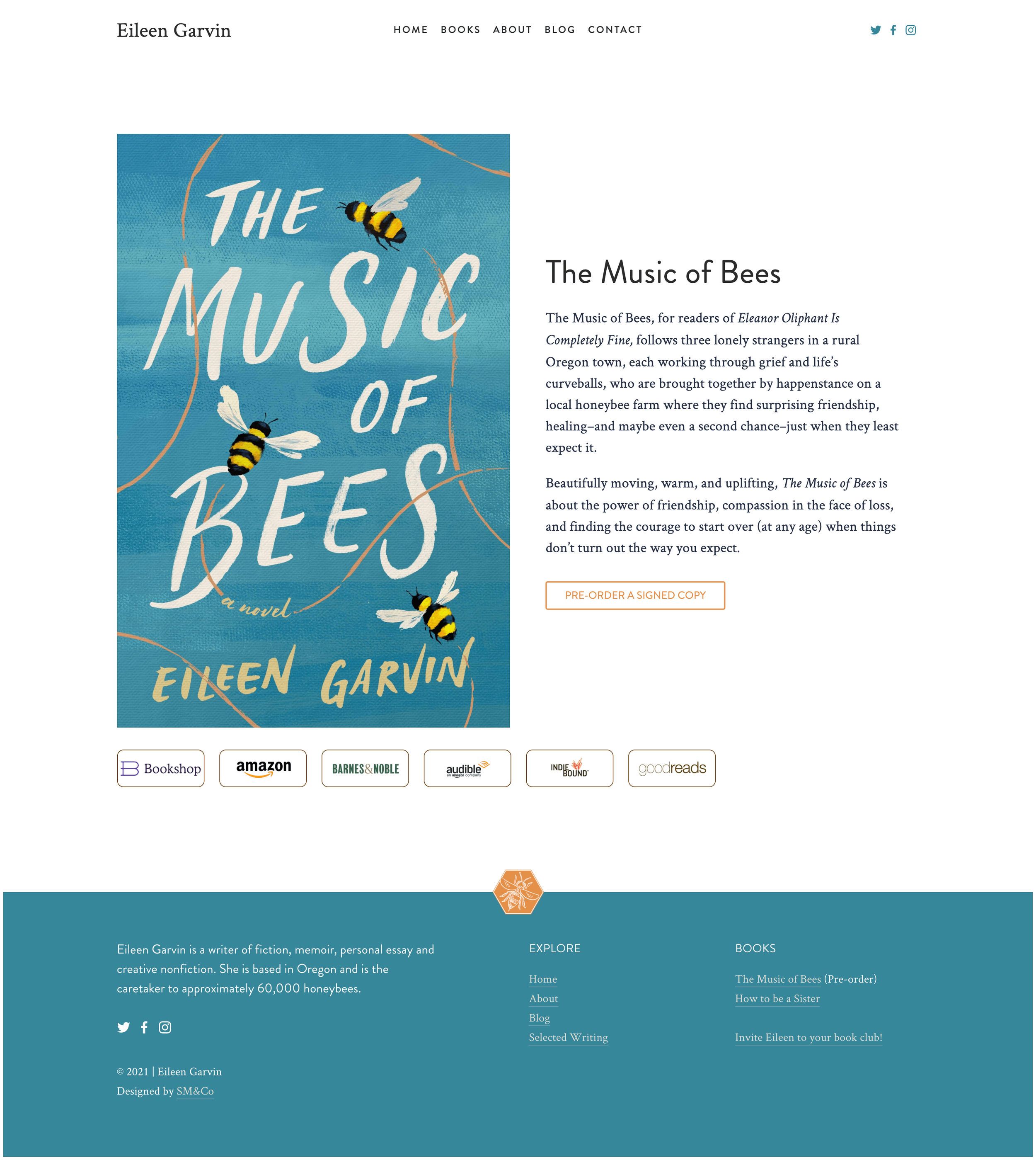
Eileen Garvin is an Oregon-based author whose first novel is forthcoming from Dutton in April of 2021. She had a basic DIY Squarespace (aff link) website, but for her book publicity that really wasn't enough.
We love Squarespace for author websites!
While Squarespace isn't the best choice for some websites, it's hands-down our favorite for authors. It's basically no maintenance, you can create a beautiful author website without investing heavily in branding (we love fantastic brands, but not everyone is ready for one—it's a serious investment and not essential at times), and there's tech support available when you're updating your website in the middle of the night. 👀
We recommend that authors focus on ensuring their websites are flexible.
This means that while we made Eileen's new book front and center, we also ensured that the colors, typography and design elements would work in the future too. We played on both the theme of bees (Eileen is a beekeeper) and also developed a "Swiggle" design detail that can be read in many ways, from bee flight path to note-taking doodle.
The color palette, too, is one that will match many styles of future book covers and can be easily modified by simply changing the tones in the palette.
This book page is just waiting for some fabulous blurbs, thanks to a hidden section on the site.
We always like to add surprise touches to our clients' sites and this one was no different. Since Eileen doesn't have a formal brand mark, we made a signature graphic in the form of a monogram—but featuring a bee, sneakily hidden in the footer.
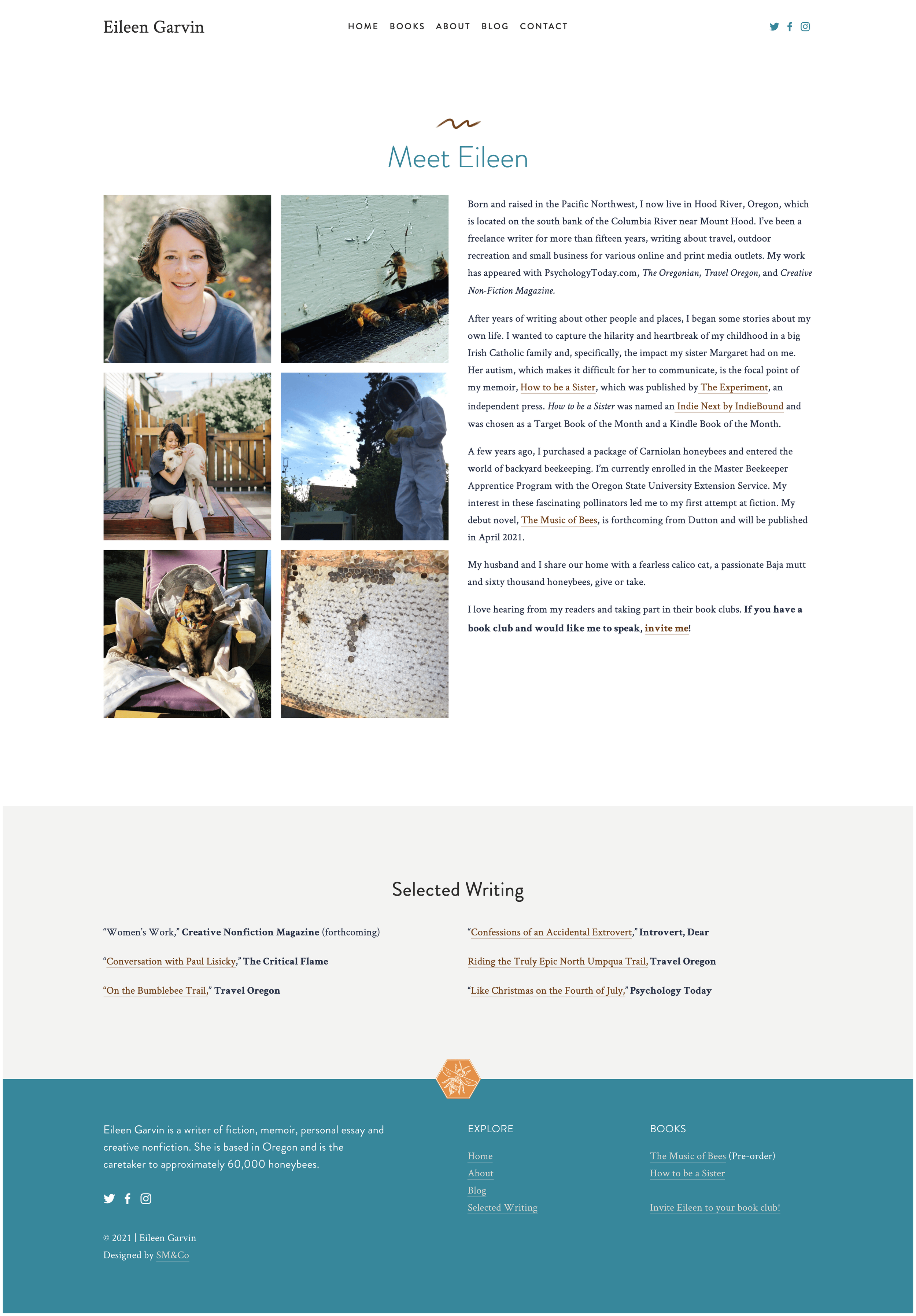
We 100% believe that author websites should be full of personality—people love connecting with their favorite authors and getting a bit of "behind the scenes" feel on their websites.
A few takeaways from this author's Squarespace website that you can adapt:
Keep your website structure clear and organized—this allows you to easily adapt as you add more content.
Use a flexible palette and typography that you can grow with.
Even if you don't have a brand, have some element that feels like a signature visual that people can remember.
Make it clear how people can engage with you—in Eileen's case it's inviting her to speak to your book club.
Don't shy away from personality—human connection makes a huge difference across industries. Be real, be human, let people get to know you!


